Cringe-Worthy Magazine Covers That Will Make You Uncomfortable
The age-old saying, don’t judge a book by its cover, does not hold when it comes to magazines. So periodicals choose to put a known face on the front to grab the attention and entice new readers.
Nevertheless, there are occasions when print media is in the news for the wrong reasons, thanks to its cover page. Well, even photoshop can go wrong, leading to an awkward situation.
And Just like That It Went Wrong
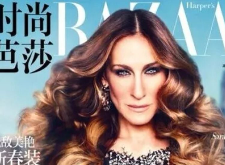
Sarah Jessica Parker has been a fashion icon for decades, and almost many women around the globe draw inspiration from the actress. Unfortunately, she grabbed eyeballs for the wrong reasons when she became the face of one of ‘Harper’s Bazaar’s’ editions.
OskieMignon via Twitter
The War of Words Got Out of Hand
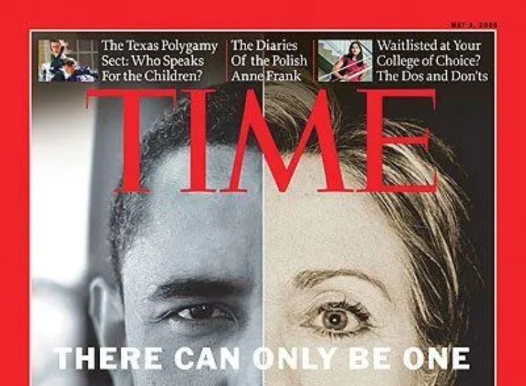
2008 was a critical year for the American political system as two of the strongest candidates stood for the presidential election. Both Barack Obama and Hilary Clinton enjoyed a massive fan following, and any article about them drew attention.
Source: Pinterest
That is when ‘Time’ magazine decided to pit the two personalities against each other. We are certainly put off by how the faces of the two politicians are photoshopped next to each other, and the headline is the cherry on top.
Hard to Recover from a Rolling Disaster
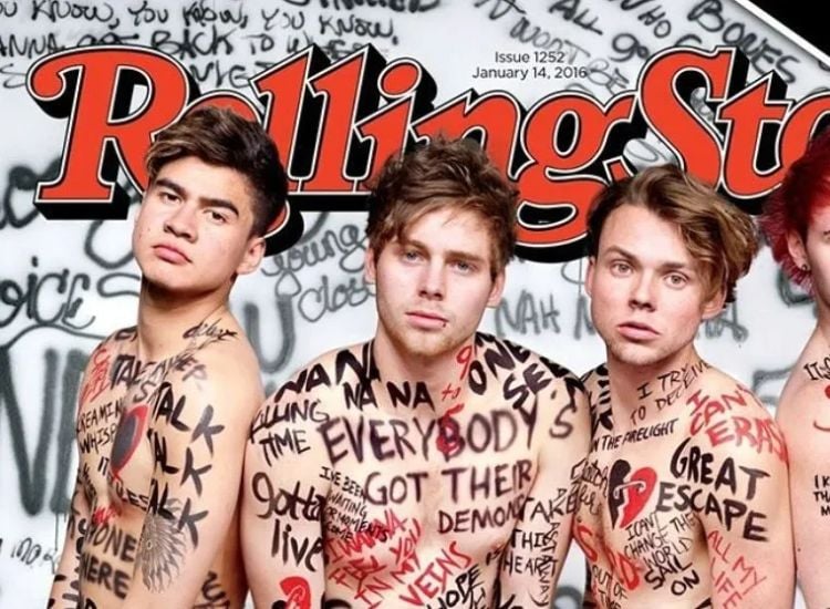
Appearing on magazine covers is a milestone in any celebrity’s career. So when the Australian boy band ‘5 Seconds of Summer’ appeared as the face of the ‘Rolling Stone’ periodical, things did not turn for the better. Instead, the band members became a subject of criticism from many people, including the fans of ‘5SOS’.
Source: chaparrita3125 via Twitter
Well, provocatively portraying the young musicians did not prove fruitful for the magazine but rather a lesson for a mindful portrayal of public figures.
A Few Dropped Commas
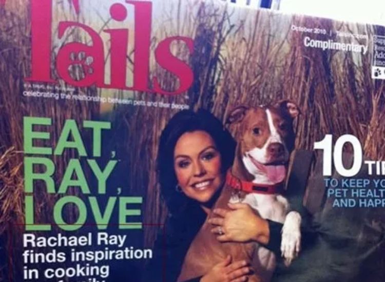
Yes, you read the headline right, but we know it didn’t mean to convey the message that Rachael Ray has been cooking her family and dog. Unfortunately, no one proofread the statement before publishing it on the cover. A few missing commas ended up portraying Rachael as a cannibal.
Source: tailsmagazines via Twitter
We hope Rachael’s friends and family continued to enjoy her company after the periodical hit the market.
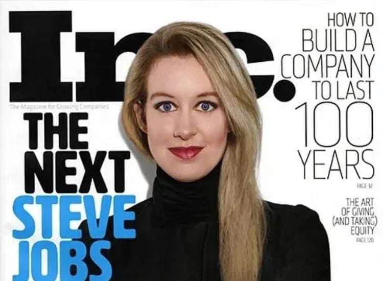
The Next Tech Biggie in Town
Who does not love a nice success story? A central character turning all odds in his favor and eventually making it big is something that gives all of us some hope and will to do something.
Source: /u/ChocolateTsar via Reddit
Usually, we see headlines such as “The next big…”, but hardly do we get to see those people stay in the market. While we wish this woman all the best for her future, we can’t help but notice a weird resemblance with the protagonist from The Dropout.
Always Love Your Body, But After Heavy Photoshop
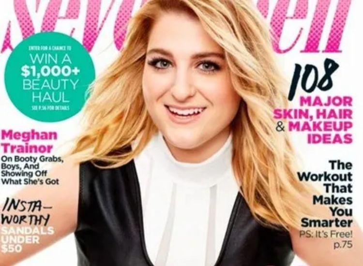
It’s funny to witness what brands can do to sell their product. When it comes to magazines, one way of selling their copies is to get a big celebrity to pose for their cover. When Seventeen decided to feature Meghan Trainor on its cover, the team also took other bold decisions which did not sit well with the readers.
Source: Will Nash via Twitter
The graphics team used their best Photoshop skills, completely altering her physique, and disregarding the fact that the singer stands for body positivity through and through.
How Do They Do It?
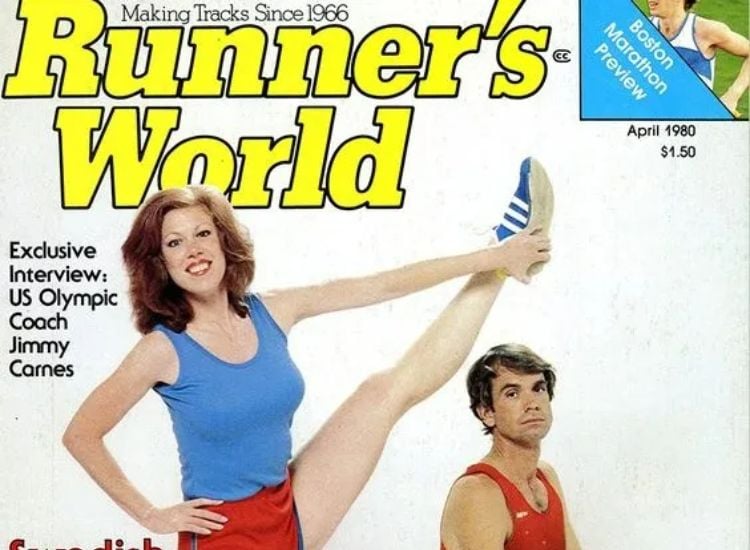
A lot of people are familiar with Runner’s World magazine. While many enjoy the content of the magazine, there are some people who are only here for the covers as the magazine has a reputation for awkward cover photos.
Source: Runner's World via Pinterest
The pose, the color combination of the outfits, and the look on the male model’s face add up to create a cover that would always catch the eye of a person. We wonder how their models pose without bursting out into laughter.
All the Parents Pay Attention!
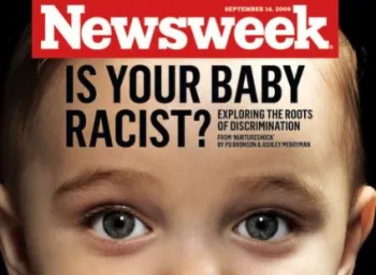
If anyone wants to keep themselves updated on the current global issues, then buying a copy of Newsweek is their best bet. The magazine attempts to have an issue on every single problem possible, and sometimes their efforts turn out to be completely outlandish.
Source: Earwax_inc via Twitter
For example, this cover is enough to get any interracial couple with a baby troubled. Now they need to worry that their baby might end up hating one parent because of their skin color.
Desperate Times Require Desperate Measures
The whole world was taken by storm when the boyband One Direction rose to popularity. Millions of people became their die-hard fans and were soon left heartbroken when one of the members, Zayn Malik, left the band.
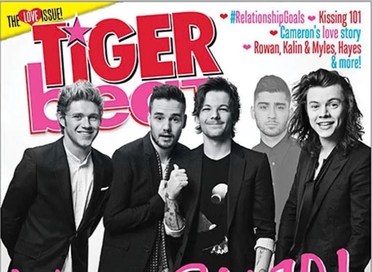
Source: nanabuchaan via Twitter
In an attempt to reunite the band, Tiger Beats magazine wanted to feature all five on their cover, but Malik refused. What now? Well, going forward with the idea and including Malik in the cover via Photoshop wasn’t the wisest idea, but they did it anyways.
This is Such a Bad Idea
Magazines that cover a wide range of topics often run into one kind of problem: the challenge of selecting what should appear on the front page and where. As a result, they sometimes come up with hilarious front cover designs that make us wonder what exactly they are thinking.
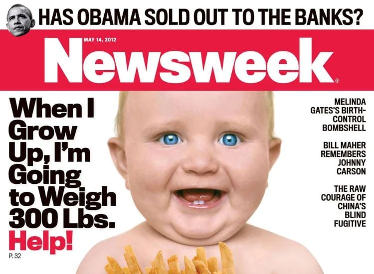
Source: nanabuchaan via Twitter
This cover of Newsweek magazine places the smiling face of a baby right beside the story of Melinda Gates’ birth control. Then, above that, we see the worrisome discourse about Obama and his banking policies. We can agree that this method of promoting different topics is odd and should be improved on.
This Interview Cover is Quite Uncomfortable
While Interview is a great name in the media world, it sometimes does a poor job of what it represents. The magazine has interviewed many celebrities in the entertainment industry and is known for its focus on those who possess great artistry and creativity.
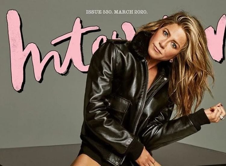
Source: HCM via Twitter`
Nevertheless, this 2020 coverage of Jennifer Aniston is a far cry from what Interview stands for. The actress’ pose was awkward at best and her picture was overly edited. We can’t blame her for this fiasco but will only hope that the editors learned from this mistake.
Almost There but Never
Old age is a great thing. We appreciate anyone that reaches the 100 years milestones and would do anything to celebrate their life’s achievement. That was what Peoples magazine was trying to do for Betty White. They interviewed her specially and got her to talk extensively about her life’s work.
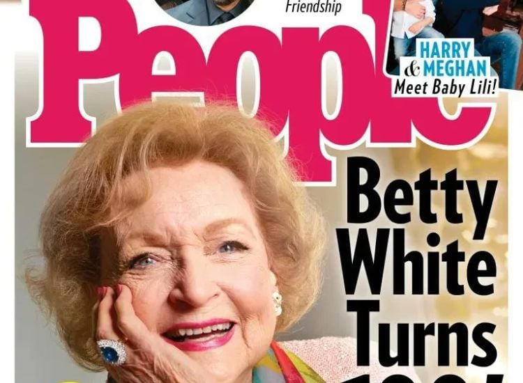
Source: Ben Dreyfuss via Twitter`
In the end, Peoples designed this cover page and hoped to release this special edition on Betty’s 100th birthday. Sadly, she didn’t make it. White passed on a few days before she turned 100 and this cover remains an awkward reminder of that fact.
Priyanka and her Photoshopped Armpit
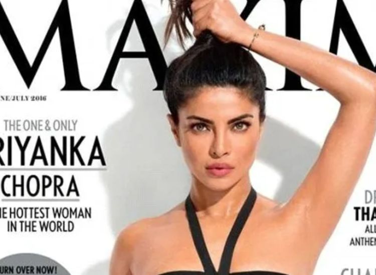
Priyanka Chopra is one of the most famous actresses in the world. Men’s magazine Maxim once featured her on its front cover and nobody batted an eyelid. What got people’s attention, though, was the fact that in the picture, the actress’ armpits were totally Photoshopped out. To most people and Chopra herself, that was very awkward.
Source: Daily Mail Celebrity via Twitter
Well, she didn’t seem to think much about it but instead, chose to handle the matter smoothly. Priyanka took a picture of her armpits, posted it on social media just the way it is, and called it a ‘pit-stopping’ picture. What an interesting way to go.
This Prince Harry's Photo Doesn't Look Like Him
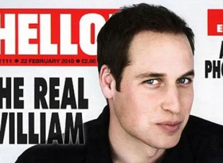
Hello magazine began publication in the late ’80s. A derivative of its Spanish counterpart, ¡Hola!, it first became a household name in the UK but is now widely read on the global front. One of the things they brag about is their ability to cover historic events which include news about the royal family.
Source: BS Slayer via Twitter
Yet, Hello doesn’t always excel at its job. This front cover picture, described as a rare historic photo of Prince Harry, is a terrible design. The picture may be historic in its timing but it will go down as one of the worst representations of the prince.
Stephen Colbert Self-Promotion
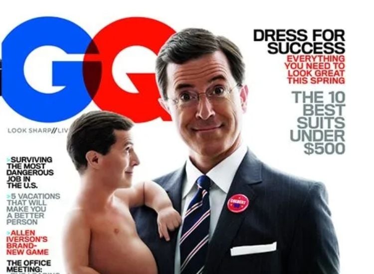
In an uncomfortable GQ cover, Stephen Colbert seems to have made himself the “Face of America” by holding a miniature version of himself with an awkward expression. The cover’s caption, “Who’s your daddy now, America?” adds to the cringe factor.
Source: Pinterest
However, it’s safe to say that Colbert isn’t actually the father of the country, and perhaps it’s one of the Founding Fathers instead. Overall, the cover gives off an awkward vibe that’s hard to ignore.
The Awkward Poses of Virtual Reality
As virtual reality evolves into an increasingly immersive experience, Facebook’s “metaverse” and video games are leading the way. The media is now discussing the implications this could have on our future.

Source: Reddit
Time magazine, a pioneer in covering cultural trends, has also delved into virtual reality. However, looking back at their cover, it now seems cringeworthy, as we are still working to perfect this technology. The way the young boy poses in the photo only adds to the awkwardness.
Filmfare's Unusual Depiction of Pregnancy
If you’re familiar with Indian pop culture and news, chances are you’ve heard of Filmfare – one of the most widely read entertainment magazines around. However, one of their covers caused quite a controversy. They left the usual celebrity gossip and showcased something straight out of fiction: a cisgender male pregnancy.

Source: Filmfare
Before now, photo manipulation required real props and effort, but this cover just looks…well, awkward. The pregnant man doesn’t even look convincingly pregnant which only adds to the awkwardness.
Implied Suggestion on Bloomberg's Cover
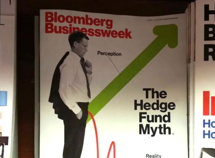
Bloomberg Businessweek, previously known as Businessweek is a well-respected magazine that has been in circulation for nearly a century. However, they could not escape criticism when the person responsible for this cover completely missed the mark maybe in an attempt to be humorous.
Sourced: Reddit
The cover presents a man with an arrow protruding from him, which could easily be interpreted as a suggestive innuendo. The description of “perception” and “reality” made this even more cringe.
Rolling Stone's Blunder With History
Rolling Stone, a reputable publication, is expected to be thorough in their work before publishing. However, they seemed to have missed a crucial detail in one instance.

Source: Slate via Twitter
They featured Julia Louis-Dreyfus on their cover, inspired by her role as the Vice President in Veep. They engraved on her back a fake American constitution which unfortunately had John Hancock’s signature known to be on the Declaration of Independence and not the Constitution. This created a stir as history enthusiasts spotted the error.
Meghan and Harry Looking Computer Generated
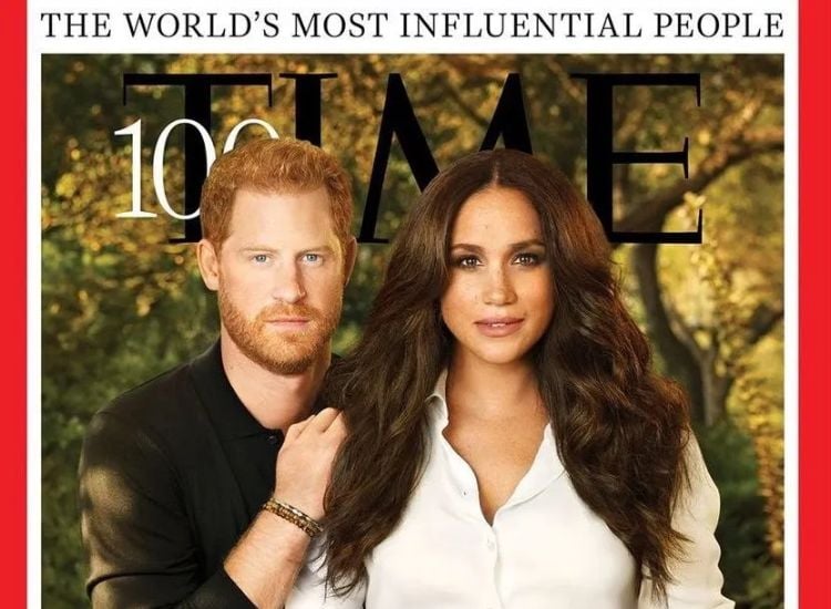
The Time magazine cover featuring Meghan and Harry as two of the most influential people of 2021 did not come without controversy. While the piece talked about their humanitarian works, the internet focused on the lack of authenticity and the weird pose in the image.
Source: Slate via Twitter
Many noticed that the famous couple had been heavily airbrushed and photoshopped. Even more hilarious, one user pointed out how Harry strangely looked as if he was Meghan’s hairdresser in the picture.
Carrie Underwood Missing a Vital Body Part
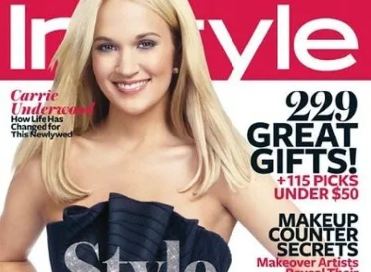
There’s something seriously off about this cover of InStyle featuring Carrie Underwood. At first glance, she looks stunning, but a closer inspection reveals a strange detail – one of her wrists is missing.
Source: Slate via Twitter
The magazine editor seemed so caught up with the image tuning that he forgot human arms don’t bend at such angles. It’s also possible we are entirely wrong here, and either Carrie is a master contortionist, or she doesn’t have any bones!
Taylor Swift From Mars
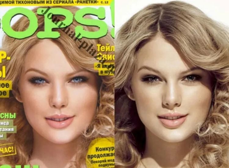
Oops! magazine had their oops moment when they dropped their magazines with a creepily altered Taylor Swift on the cover. The editors changed her eye color and airbrushed the original picture, hoping no one would notice, but you can’t fool keen-eyed swifties!
Source: Reddit
Instead of rushing to buy the magazine, her fans pointed out how unnatural she looked in the photo. The sharp eyes and strangely smooth skin made her look more like an alien than a human.
Sparking Uncomfortable Questions About Breastfeeding
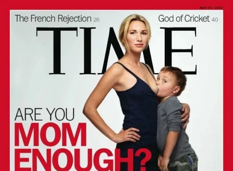
When Time dropped this cover of a mother breastfeeding her son, it sparked a flurry of debate and discussion. Many considered it inappropriate to feature a breastfeeding mother on the cover of a widely-read publication, while others opined that public breastfeeding should be normalized.
Source: Reddit
Some did catch up with what the magazine intended to do and talked about how the child was too old to be breastfed. Well, Time surely knows how to cause a commotion with their covers.
Doll Reader’s Unexpected Cover Star
A magazine like Doll Reader was the last place people expected to see celebrity fitness trainer Richard Simmons. As soon as it hit the stands, readers pointed out how the cover gave them the creeps.
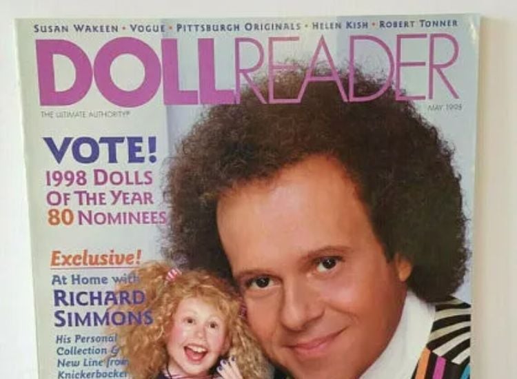
Source: ravensroostantiques via eBay
The photo looked quite normal, but it was hard to ignore its unsettling quality. His intense gaze with those black, soulless eyes probably added to the effect. Notwithstanding these vibes, we are sure this was a wholesome piece about Richard and his doll collections.
Lost in Translation or Is It Language?
Der Spiegel, a widely-read German magazine, intended to publish a feature on Queen Elizabeth II. The cover, however, overshadowed the story due to an unfortunate linguistic mishap.

Source: Daniel Rosney via Twitter
In German, “die” translates to “the,” so “Die Queen” simply meant “The Queen.” Yet, the proper term for “queen” in German is “Königin.” By not keeping the language consistent, the magazine inadvertently created unnecessary confusion and controversy.
Headstrong: Pharrell's Lesson in Respect
In 2014, Pharrell Williams faced backlash for wearing a Native American headdress on Elle UK’s cover and was accused of cultural appropriation. The headdress holds significant meaning for indigenous tribes, only to be worn by respected leaders and warriors so Pharrell’s misuse was seen as disrespectful.
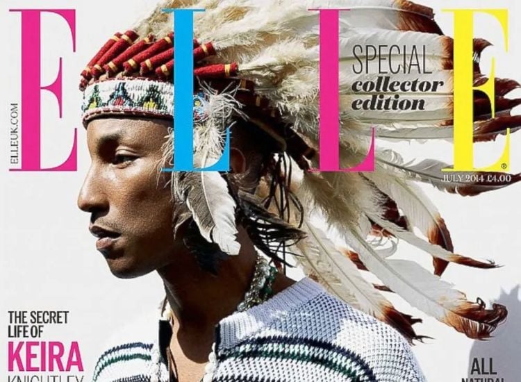
Source: Elle UK
In 2014, Pharrell Williams faced backlash for wearing a Native American headdress on Elle UK’s cover and was accused of cultural appropriation. The headdress holds significant meaning for indigenous tribes, only to be worn by respected leaders and warriors so Pharrell’s misuse was seen as disrespectful.
Mitt Romney's "Wimp" Conundrum
Newsweek stirred controversy with their 2012 presidential election cover for labeling Republican presidential nominee Mitt Romney a “wimp” and questioning his suitability for the presidency. The story highlighted Romney’s evasion of the press, concealed tax returns, and apparent apprehension toward his party’s base.

Source: Newsweek
Romney countered the accusation, drawing a comparison with George H. W. Bush, who had faced similar criticism but went on to have a successful presidency.
Shorts Saga: Palin vs. Newsweek
Newsweek’s 2009 cover showcasing Sarah Palin in bike shorts, sourced from a previous fitness photoshoot, sparked controversy. The former Vice Presidential candidate expressed her displeasure with the publication’s choice, pointing out that the original Runner’s World profile centered on health and fitness.
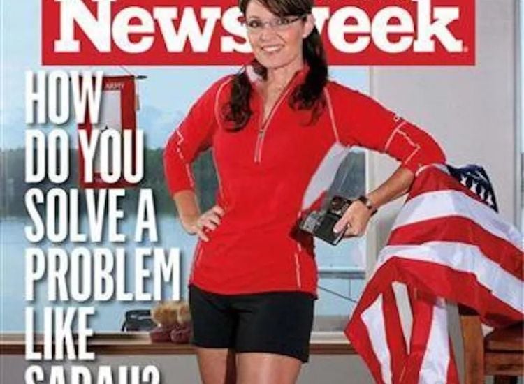
Source: Newsweek
Palin accused Newsweek of employing a sexist and all-too-predictable approach by using the image out of context. She emphasized the importance of not judging people based on appearance, gender, or race.
Time's OJ Image Blunder
Amidst the OJ Simpson trial frenzy, Time and Newsweek published cover stories displaying the notorious ex-football star and actor-turned-murder suspect’s mugshot.
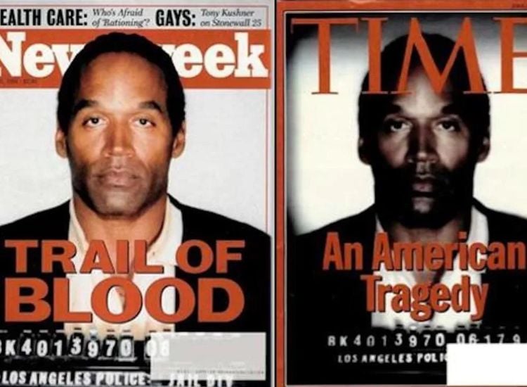
Source: Newsweek/Time/Reddit
Time’s version, however, came under fire for digitally darkening Simpson’s skin and making him look unshaven and unclear, drawing accusations of racism. Consequently, the magazine was pulled from newsstands and re-released with an untouched photo of Simpson gracing the cover.

As can be seen, the And Just Like That… star’s photo got immediate attention from the netizens for being heavily retouched. This a lesson for the print media, which heavily relies on photoshopping.